Responsive Web Design
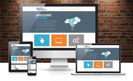
 Responsive web design is an approach to web design aimed at allowing desktop web pages to be viewed in response to the size of the screen or web browser one is viewing with.
A site designed with RWD adapts the layout to the viewing environment by using fluid, proportion-based grids, flexible images, and CSS3 media queries, an extension of the @media rule, in the following ways:
The fluid grid concept calls for page element sizing to be in relative units like percentages, rather than absolute units like pixels or points.
Flexible images are also sized in relative units, so as to prevent them from displaying outside their containing element.
Media queries allow the page to use different CSS style rules based on the characteristics of the device the site is being displayed on, most commonly the width of the browser.
In the present era, we see mobile technology around us and that was not common a few years ago, at that time websites were designed in-plane HTML table-based to fit on desktop monitors/laptop screens but in today’s world we see there are billions of internet users browse websites through tablets/mobile and internet is not just limited to use on desktop/laptop devices. As technology changed new challenges arrived, because websites were not designed for mobile/tablet devices so the result is distorted.
We design websites for mobile-friendly/responsive so that users can browse your website on desktop/laptop/mobile/tablet or other small or large screens and turn potential customers into the business. We can help to turn your old website into a mobile-friendly too.
To get started with responsive web design, Call +923162494380 Or Email Info@revolutioneye.com
